From moodboard to interior render: explain your references
Turn a collection of inspiration images into a useful visualization brief by labelling what you like and separating mood from specific products.
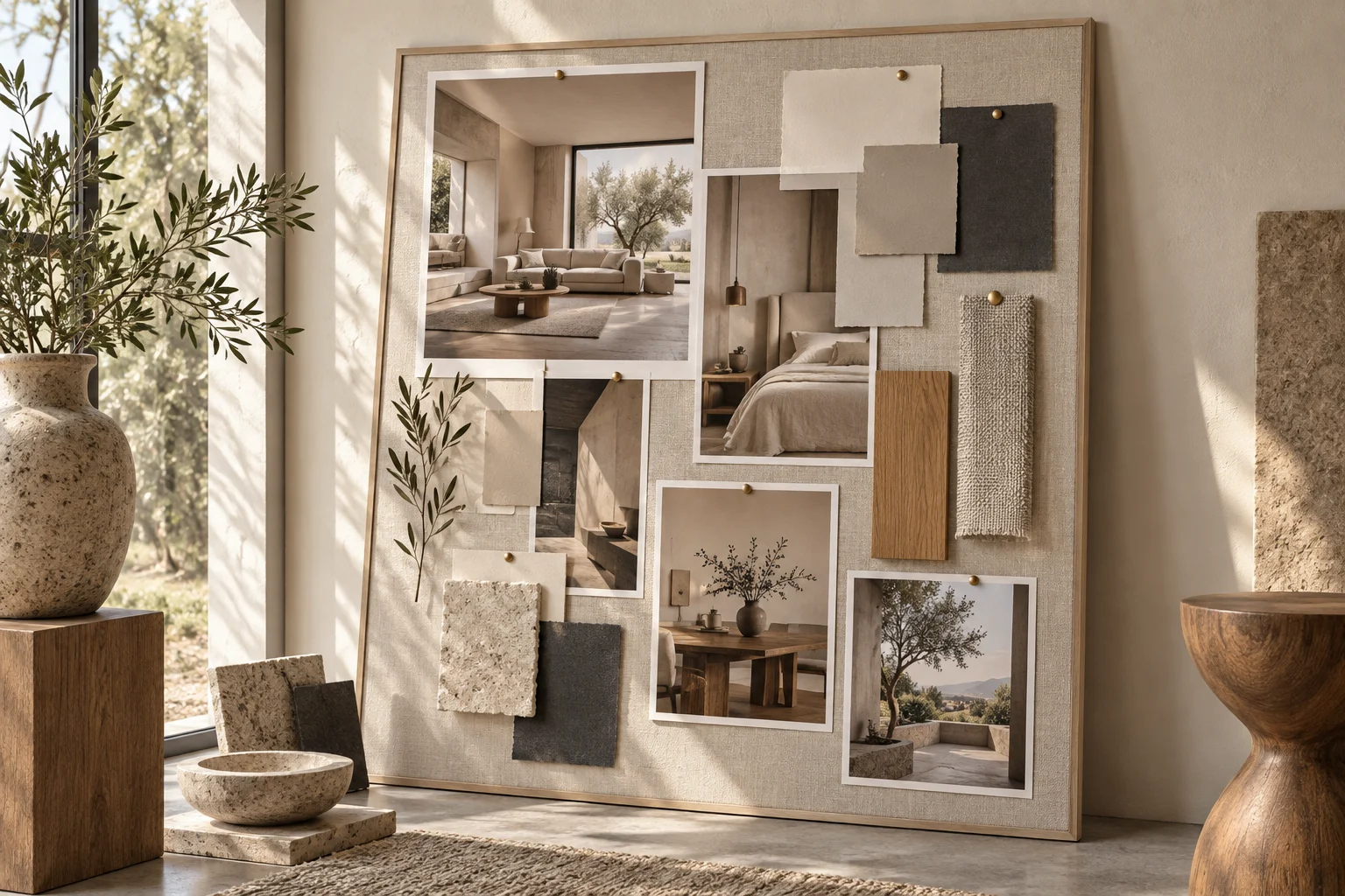
A moodboard becomes useful when it communicates choices rather than simply collecting attractive rooms. The visualization team needs to know which part of each reference matters.
Give every image one job
Label references with a specific observation: warm timber tone, restrained shelving, soft window light or rounded furniture. Do not ask for every element of several unrelated interiors at once. Separate references for layout from those for atmosphere.
Identify contradictions
Check whether references suggest conflicting directions, such as highly polished surfaces and an entirely matte room. Decide which quality has priority. Add a short “avoid” list where helpful; it can prevent a favourite image from being interpreted too literally.
Translate the mood into decisions
Choose a limited set of materials, furniture forms and lighting intentions to test in the actual room. Keep product choices provisional until confirmed. Use the first visualization to check whether the selected qualities work together, then revise the specific mismatch. A focused comment such as “reduce contrast in the cabinetry” is more useful than adding another unrelated reference.