Compare interior colour palettes in the same render
Evaluate alternative interior palettes with consistent lighting, camera position and furniture, then confirm the choice using physical samples.
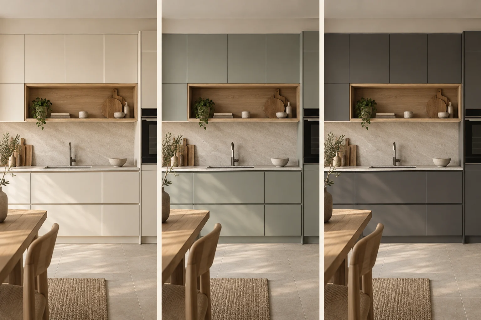
Colour comparisons are easier to interpret when the scene stays unchanged. If the camera and lighting also change, you may prefer the presentation rather than the palette.
Decide what can vary
Start with a base scene and name the surfaces allowed to change. For example, compare cabinet fronts and wall paint while retaining the floor and sofa. Label alternatives clearly and keep the material references beside them.
Compare the whole relationship
Review the palette in an overview, not only in isolated swatches. Ask whether the focal point remains clear and whether adjacent materials compete. If the question concerns a small junction, add a detail view using the same light.
Confirm outside the screen
Screens, image processing and ambient light affect appearance. Use renders to narrow choices, then inspect actual samples together in the intended space where possible. Keep the chosen reference identifiers in the final brief. A colour name alone can be interpreted differently when the project moves from visualization to purchasing.